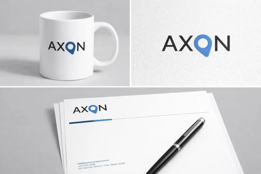
We developed a wordmark for AXON that combines simple typography with a distinct visual idea. The letter O becomes a symbol inspired by a location pin, placing the concept inside the name itself.
A symbol within the wordmark
The pin-inspired O points to precision, direction, focus, destination, and reaching the right place. It gives the name a memorable detail without sacrificing a clear reading of AXON.
Color and contrast
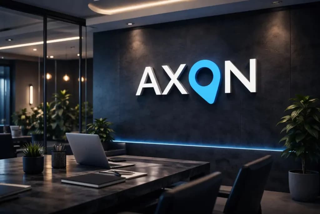
Blue highlights the symbol and was chosen for its associations with trust, professionalism, stability, innovation, and technology. White letterforms retain clarity against a dark background. The contrast draws attention to the O first and then to the complete name.
Typography and applications
Bold uppercase lettering creates a confident, modern horizontal mark. The structure is intended to work across websites, mobile apps, presentations, social media, stationery, signage, and other print or digital uses.
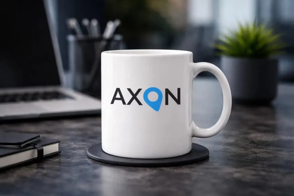
The final identity connects a direct visual message with a practical wordmark that remains easy to recognize in different settings.