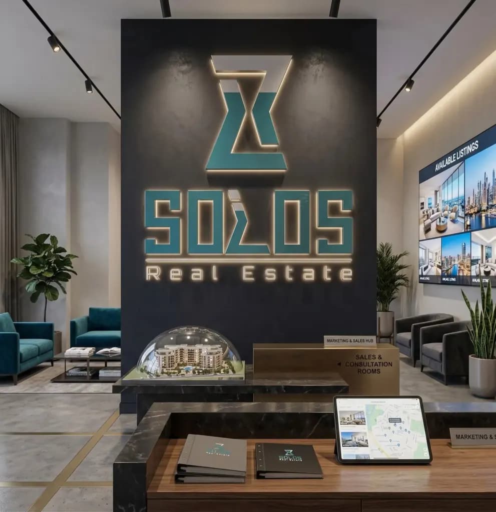
We created a logo for Solos Real Estate to convey stability, trust, and a contemporary presence in the property market. The work began with market and competitor analysis, definition of the brand's personality, and research into its audience before the final direction was selected.
The visual concept
The mark uses architectural geometry and a subtle letterform. Its structured lines and proportions suggest buildings and stability. The concept also draws on an hourglass: the upper third represents vision and innovation, while the lower two-thirds stand for sustained effort and the value of time in creating long-term results.
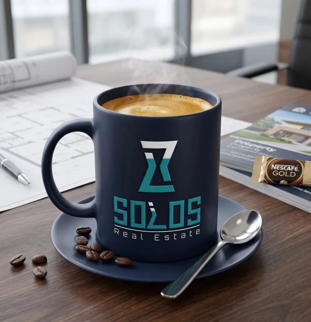
Typography and color
A geometric typeface complements the symbol without overpowering it. Dark blue expresses reliability, teal adds a sense of growth, and white provides clarity. Together they create a restrained identity suitable for a real estate business.
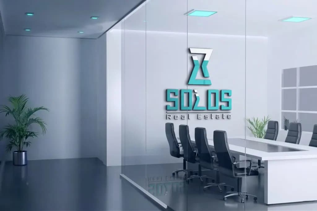
Designed for different uses
The balanced construction keeps the logo legible at small sizes, such as app icons, and at larger sizes, such as signs and billboards. It can also be used across printed materials and digital brand touchpoints.
The result combines a simple shape with a considered idea, giving Solos Real Estate a recognizable identity that can be applied consistently.